In Part 1 of this series, we learned the basics of color psychology and the role it can play in advertising. This segment will discuss enhancing your website through color psychology. If you are looking to increase conversion rates and improve user experience, then this post is for you!
Website Color
Does your website need COLOR? Creating a logo or an ad targeting how you want your consumers to feel is excellent; however, when users land on your website, is that sentiment maintained or intensified? What type of color changes could one make to a website to increase sales and conversions? How can color psychology be implemented to improve websites?
Color associations can vary from person to person and culture to culture. Men and women usually have different color preferences as well.
When deciding on website colors, try to find hues that will match your logo and appeal to your target demographic.
Consider This Study
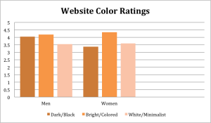
A number of men and women were asked to rate how pleasant or unpleasant 30 different websites made them feel using a scale of 1 to 5 – ‘1’ being ‘very unpleasant’ & ‘5’ being ‘very pleasant’. 10 of the websites were dark/black sites, 10 were white/minimalist sites, and 10 were sites of different bright colors.
Here’s how they rated the websites: Women preferred bright/colored websites most, with an average rating of 4.35. With an average score of 4.18, men also favored bright/colored websites best. Men ranked the dark/black websites a close second; 4.04 on average. By contrast, the women gave dark/black sites the lowest rating with a score of 3.38. The white/minimalist websites ranked about the same for both genders with women rating the sites 3.6 and men with 3.54.

Buttons
OK, now that you know which theme color to use for your website, what color should goals, actions and things you want to stick out be? i.e: ‘Like’ buttons, for instance.
Did you know that the color of backgrounds and buttons could influence consumer decisions? Believe it or not, even something as simple as the color of an ‘Order Now’ button can affect consumer behavior.
Quick Study

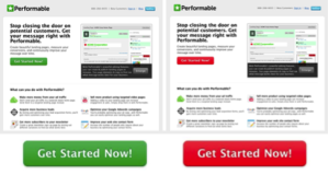
Even though it was originally predicted the green button would perform better, the red button resulted in 21% more clicks. The pages were exactly the same except for the color of the button and yet the red button was clicked 21% more times.
If you’ve read any online color studies, then you’ve heard of BOB (The Big Orange Button). For years, BOB performed better than any other color when it came to call-to-action buttons (Wiki Link). If you just visited that wiki link, there’s a good chance you clicked BOB (even though you didn’t need what it was linked to).


